Regression Plots
Traditionally to perform regression plots you would need to process your data in an external program or language such as Python, R, MATLAB, etc. and then import the results into LaTeX. This is not ideal as it requires you to have a working knowledge of the language you are using and the ability to export the data in a format that LaTeX can understand. An additional layer of complexity is added if you want to maintain visual cohearence with other LaTeX plots in your document.
To solve this issue I have developed a package that allows you to perform regression plots directly in LaTeX using LuaLaTeX.
The Lua-Regression package allows you to perform regression plots directly in LaTeX using LuaLaTeX. This means that you can perform regression plots without the need for an external program or language. The package is designed to be easy to use and requires minimal setup. Plotting is handled by the PGFPlots package, which is covered in the TikZ/PGF LaTeX Graphics section of this guide.
The package is available on the Comprehensive TeX Archive Network and GitHub.
CTAN Lua Regression | Lua Regression GitHub Repository
Installation
The package is available on the Comprehensive TeX Archive Network and can be installed using the LaTeX package manager you have installed.
Alternatively, you can download the package from the GitHub repository and install it manually in your local texmf directory.
Features
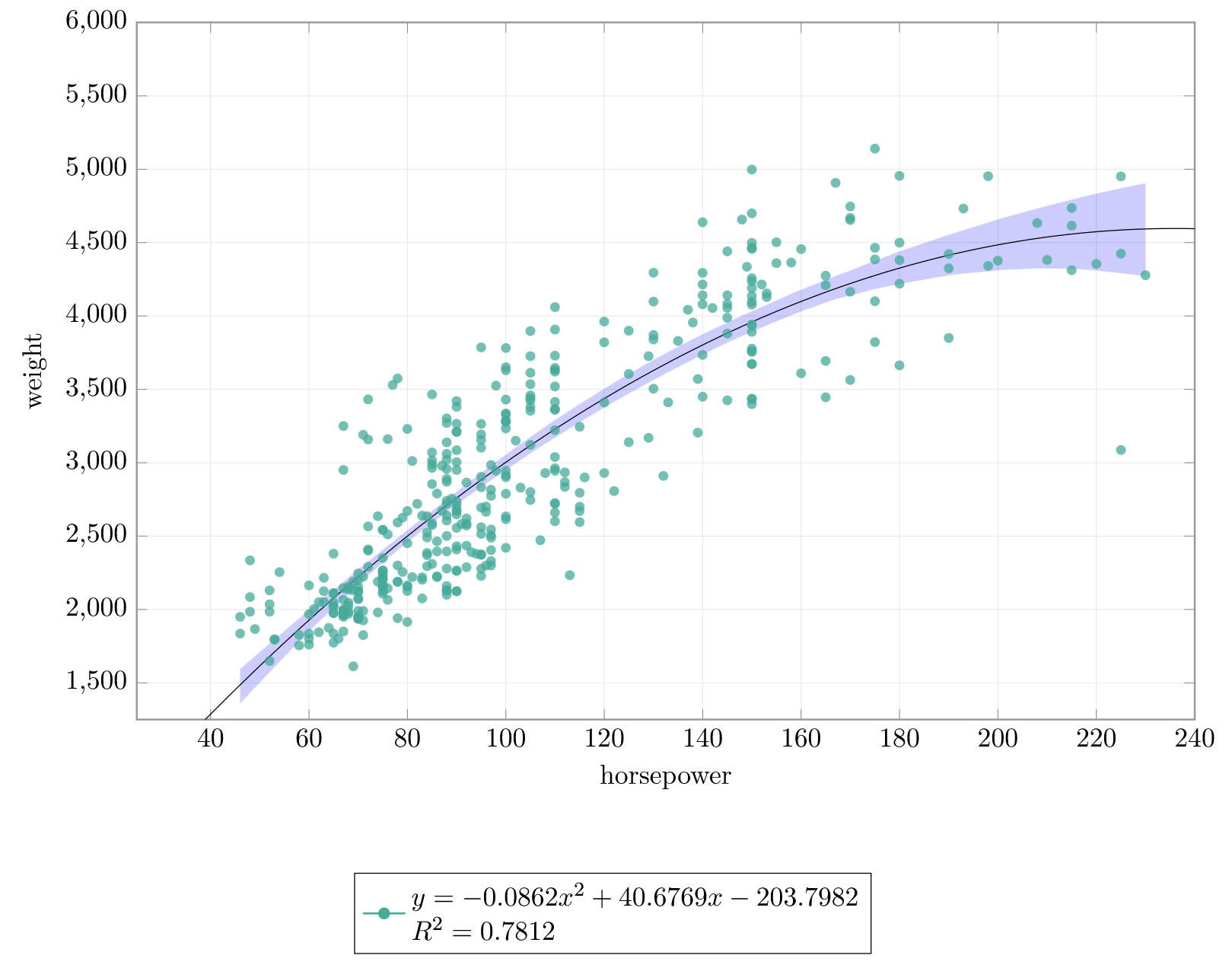
The package includes the following features: - Perform regression plots directly in LaTeX using LuaLaTeX. - Fit polynomials of multiple orders to data. - Confidence intervals and error bands using the bootstrap method. - Perform \(R^2\) tests on the data.
Calling the Package
To use the package, you need to call it in your LaTeX document using the following command:
Info
Lua indexes at 1, so the first column in your CSV file is column 1, the second column is column 2, and so on.
This will load the package and make it available for use in your document. You can also specify the options you want to use with the package. The main options are:
xcol: The column number of the x data in the CSV file.ycol: The column number of the y data in the CSV file.order: The order of the polynomial to fit to the data.ci: Confidence interval on or off.plot: Plot on or off.
More options are available in the package documentation.
Example
        \begin{tikzpicture}
            \begin{axis}[
                height=6.45cm,
                width=\textwidth,
                domain=0:300,
                samples=1000,
                xmin=25,
                xmax=240,
                xlabel=horsepower,
                ytick={},
                xtick={},
                ymax=6000,
                ymin=1250,
                ylabel=weight,
                grid=both,
                legend columns = 2,
                legend style={cells={align=left},at={(0.45,-0.22)},anchor=north},
                legend cell align=left,
                major grid style={line width=.2pt,draw=gray!20},
                every axis/.append style={axis line style={gray!80, line width=0.75pt}, tick style={gray!95}}
            ]

            \addlegendimage{p4, mark=*, thick}
            \addlegendimage{p8, thick}

            \pgfplotstableread[col sep=comma]{example/mpg.csv}\datatable

            \addplot [p4,mark=*,fill opacity=0.75, draw opacity=0] table [only marks,col sep=comma,x=horsepower,y=weight]{\datatable};

            \luaregression[xcol = 4, ycol = 5, plot = true, eq = true, r2 = true, order = 2, ci = true]{example/mpg.csv}

            \end{axis}
        \end{tikzpicture}