Code Display
The minted package is a popular choice for code display in LaTeX. It uses the Python package Pygments to
highlight code. To use minted, you need to have a Python distribution installed on your system. TeX Live will handle
additional installations that are required. If you are using MikTeX more information can be found on the
Minted CTAN Page.
Note
From version 3 of minted, shell escape is no longer required.
Note
Minted supports a wide range of languages, including Python, C++, Java, and many more. For a full list of supported languages, please refer to the Pygments documentation. Only Python will be demonstrated here.
Using minted on a code block
\documentclass{article}

\usepackage{minted}
\usepackage{xcolor}
\usepackage[margin={2.5cm,2.5cm}]{geometry}
\definecolor{code-bg}{RGB}{29, 35, 49}
\setminted{autogobble,breaklines,breakanywhere,python3}

\begin{document}
    \begin{minted}{python}
        import pandas as pd
        import matplotlib.pyplot as plt
        import numpy as np

        # Define the file path
        file_path = r'C:\Users\YourName\Data.xlsx'

        # Read the Excel file
        # df = pd.read_csv(file_path)
        df = pd.read_excel(file_path)

        # Prepare data for box plot
        # Transpose the DataFrame to have landmarks as columns and cases as rows
        df_transposed = df.transpose()
        # The first row now contains the landmarks, set it as header
        df_transposed.columns = df_transposed.iloc[0]
        # Drop the first row as it's now set as the header
        df_transposed = df_transposed.drop(df_transposed.index[0])

        # Convert all columns to numeric types, errors='coerce' will set non-convertible values to NaN
        df_transposed = df_transposed.apply(pd.to_numeric, errors='coerce')

        # Plot the box plot
        boxplot = df_transposed.boxplot()
        plt.xticks(rotation=45)  # Rotate x-axis labels for better readability

        # Customize the plot
        plt.title('Displacement Distribution')
        plt.xlabel('Landmark')
        plt.ylabel('Displacement')

        # Display the plot
        plt.tight_layout()
        plt.show()
    \end{minted}
\end{document}
Which would produce the following output:
import pandas as pd
import matplotlib.pyplot as plt
import numpy as np

# Define the file path
file_path = r'C:\Users\YourName\Data.xlsx'

# Read the Excel file
# df = pd.read_csv(file_path)
df = pd.read_excel(file_path)

# Prepare data for box plot
# Transpose the DataFrame to have landmarks as columns and cases as rows
df_transposed = df.transpose()
# The first row now contains the landmarks, set it as header
df_transposed.columns = df_transposed.iloc[0]
# Drop the first row as it's now set as the header
df_transposed = df_transposed.drop(df_transposed.index[0])

# Convert all columns to numeric types, errors='coerce' will set non-convertible values to NaN
df_transposed = df_transposed.apply(pd.to_numeric, errors='coerce')

# Plot the box plot
boxplot = df_transposed.boxplot()
plt.xticks(rotation=45)  # Rotate x-axis labels for better readability

# Customize the plot
plt.title('Displacement Distribution')
plt.xlabel('Landmark')
plt.ylabel('Displacement')

# Display the plot
plt.tight_layout()
plt.show()
Using minted on python file
Which would produce the same output as above.Inline code
To use minted for inline code, you can use the \mintinline command. For example:
Customisation
There is a lot of customisation that can be done with minted. For more information, please refer to the
documentation
and Pygments style documentation.
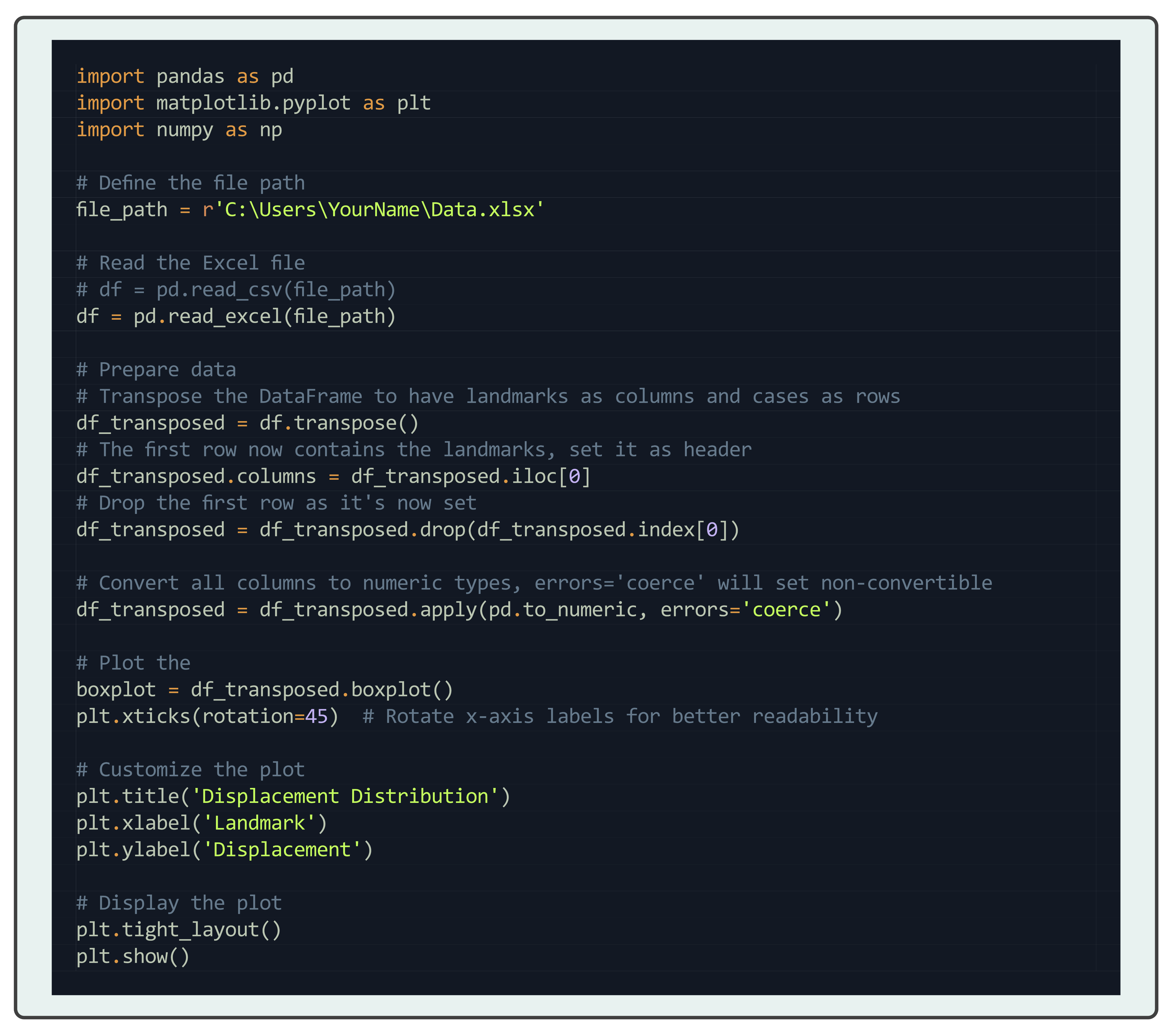
Using minted with tcolorbox
You can use minted with tcolorbox to create a box around your code. For example:
This requires the tcolorbox package to be installed and called.
Then you can use the following code:
\begin{tcblisting}{listing only, minted language=python}
import pandas as pd
import matplotlib.pyplot as plt
import numpy as np

# Define the file path
file_path = r'C:\Users\YourName\Data.xlsx'

# Read the Excel file
# df = pd.read_csv(file_path)
df = pd.read_excel(file_path)

# Prepare data
# Transpose the DataFrame to have landmarks as columns and cases as rows
df_transposed = df.transpose()
# The first row now contains the landmarks, set it as header
df_transposed.columns = df_transposed.iloc[0]
# Drop the first row as it's now set
df_transposed = df_transposed.drop(df_transposed.index[0])

# Convert all columns to numeric types, errors='coerce' will set non-convertible
df_transposed = df_transposed.apply(pd.to_numeric, errors='coerce')

# Plot the
boxplot = df_transposed.boxplot()
plt.xticks(rotation=45)  # Rotate x-axis labels for better readability

# Customize the plot
plt.title('Displacement Distribution')
plt.xlabel('Landmark')
plt.ylabel('Displacement')

# Display the plot
plt.tight_layout()
plt.show()
\end{tcblisting}
Which would produce the following output:
